The weather change in 3 charts
Go Deeper.
Create an account or log in to save stories.
Like this?
Thanks for liking this story! We have added it to a list of your favorite stories.


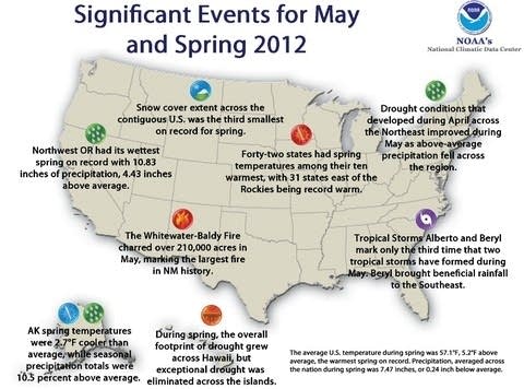
I wince as I write the words "new normal." But when it comes to weather, it's hard to ignore the data. Three charts from the National Oceanic and Atmospheric Administration bear out the changes we're seeing and feeling.
Here's a look at how much of the country is warmer this year compared to most of the the prior 20.
Two of Minnesota's top 10 seasonal temperature anomalies have come in the past year.
-- Paul Tosto
Turn Up Your Support
MPR News helps you turn down the noise and build shared understanding. Turn up your support for this public resource and keep trusted journalism accessible to all.