Our historically bad economy in 2 charts
Go Deeper.
Create an account or log in to save stories.
Like this?
Thanks for liking this story! We have added it to a list of your favorite stories.


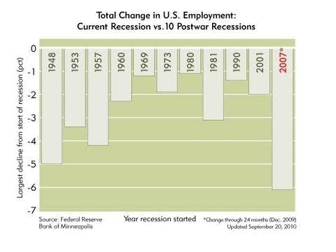
We swim through so much economic data these days -- housing starts, jobless numbers, mortgage rates, etc. -- that it's easy to lose the long view on what we've lived through in the Great Recession.
Two charts, built and recently updated by the Federal Reserve Bank of Minneapolis, offer a sobering view on just how historically bad it's been and continues to be.
Turn Up Your Support
MPR News helps you turn down the noise and build shared understanding. Turn up your support for this public resource and keep trusted journalism accessible to all.
Three years ago, I wrote (bragged?) that conditions during my first recession in 1981 were still worse than in the Great Recession.
The data have proved me very wrong. The total change in employment is really startling. In every other post-war recession, employment was above the pre-recession peak within four years. Not so this time. And most of the employment growth we've seen in the "recovery" are in low wage jobs.
Long road back.
-- Paul Tosto