Two boats won't float: Mpls. changes tack again on city logo

Minneapolis logo
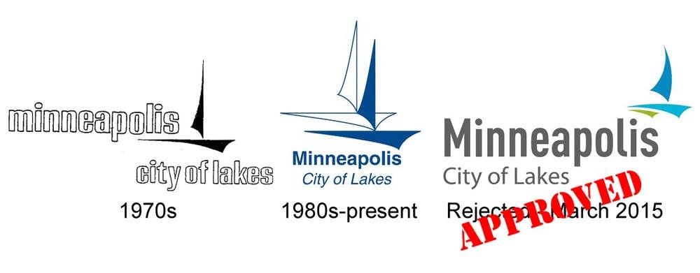
Council members in February agreed to replace the city's longtime two-sailboat logo with a hip, one-boat look. Then they torpedoed the one-boat logo. But now they want it back.
MPR News Graphic

The city of Minneapolis is changing course once again in its oddly controversial quest for a new logo.

Council members have wrestled for weeks with what image best represents the landlocked metropolis — one sailboat or two. They'd agreed to replace the city's longtime two-sailboat logo with a hip, one-boat look. Then they torpedoed the one-boat logo.

But now they want it back.

The tale of the boats began in mid-February. The city's communications office wanted to move to a more streamlined one-sailboat logo, following the corporate trend toward simpler symbols embraced by blue chip behemoths like Apple, Walmart and Starbucks.

Create a More Connected Minnesota

MPR News is your trusted resource for the news you need. With your support, MPR News brings accessible, courageous journalism and authentic conversation to everyone - free of paywalls and barriers. Your gift makes a difference.

The two boats were too spindly and didn't look good online or printed small, communications director Matt Laible told council members. He argued a new "refreshed" logo would present a more modern, professional image and help build public trust in the city.

So last month, the council voted to simplify the image. To save money, staff designed the new logo in-house. The city's name was much larger, and instead of two boats side by side, there was only one.

The remaining boat was smaller, but bolder and more colorful. It floated above the "s" in Minneapolis like a stylized apostrophe.

Then, just two days after approving the design in committee, the council felt an ill-wind.

The main concern was that the old logo was everywhere — from city fleet cars to signs to manhole covers. And there was no money to replace them all. Council Member Andrew Johnson says rather than presenting a consistent visual identity the change would just create confusion.

"We're essentially going to have two different logos or icons ... across our city for the next 20, 30, 40 years," Johnson said.

The second ship resurfaced. But the reprieve was short lived. On Wednesday, the council reversed itself again.

Members concluded that having two versions of the logo for a while wouldn't be a big deal after all, said Council Vice President Elizabeth Glidden.

"There is no car that will exist for decades to come. There is no piece of clothing that will exist, or it's unlikely that you will have your employee wear the same piece of clothing for decades," she argued. "So I think we'll not have problems with confusion about what is the city of Minneapolis?"

Some have questioned whether the sailboat really represents Minneapolis — in the 1970's or now.

Most people in the city have never been on a sailboat, and probably never will, said Julia Curran, a graphic designer and lifelong Minneapolis resident.

"It certainly isn't something you can do if you don't have a lot of money, if you don't have a lot of time," she said. "The ways that most people I know interact with water are very different."

The indecisiveness may be partially a function of the city's "weak mayor" form of government. The 13 full-time members of the City Council hold most of the power, and they sometimes have a tendency to micromanage.

While the council's Johnson wishes the city had just stuck with the old two-boat logo, he'll be glad to have the controversy behind him. In his opinion, the whole thing was making the city look a little silly.

"I don't think many of us wanted to deal with this at all and were surprised it was coming before us," he said. "It certainly is a perception issue. First we approve, then we disapprove, then we approve again of this new logo. And we have more important business in front of than this."

The council is scheduled to vote one more time on the logo this Friday. Johnson hopes it's the last time.