Twins go back to the future
Go Deeper.
Create an account or log in to save stories.
Like this?
Thanks for liking this story! We have added it to a list of your favorite stories.


The Minnesota Twins have unveiled their new uniforms. This is the baseball version of software companies releasing new operating systems. Maybe the old one works fine, but the new one is "cooler." So it doesn't come as much of a surprise that the announcement of the new uniforms comes with an appeal to buy new merchandise. Hey, Nick Punto costs money!
"New uniforms and logos are just the beginning of all of the new and exciting things..." according to the press release, which, ironically, also noted the basis for the new uniforms are designs from the past.
The road uniforms are a definite improvement over the block-lettering "Minnesota" of yesteryear (i.e. 2009):
[image]
Turn Up Your Support
MPR News helps you turn down the noise and build shared understanding. Turn up your support for this public resource and keep trusted journalism accessible to all.
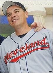
... even though they're a rip-off of the road uniforms of division rival Cleveland.
[image]
Still, it's probably a good idea to go with tried-and-true designs, rather than be remembered for this...
[image]
... or this.
[image]