The world’s top incomes
Go Deeper.
Create an account or log in to save stories.
Like this?
Thanks for liking this story! We have added it to a list of your favorite stories.


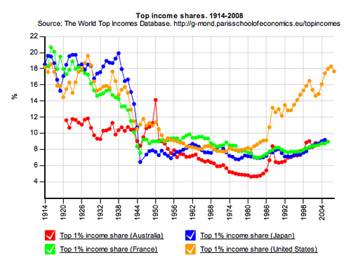
Barry Ritholtz at The Big Picture has an intriguing graphic posted today. It's a historical comparison of the top 1% of income owners in major countries.
It comes from the Paris School of Economics, which is also building an online database to allow you to crunch the numbers some more. Unfortunately, it's not entirely built out yet, although you can do a little playing on it.
Turn Up Your Support
MPR News helps you turn down the noise and build shared understanding. Turn up your support for this public resource and keep trusted journalism accessible to all.